Emma crushed it getting together a list of actions that everyone can do now to reduce their carbon footprint. We divided these actions into categories; Home, Food, Transportation and Stuff. We went through each category, figuring out the carbon footprint data for each action. Super, super time intensive. Emma and I spent a ton of time throughout the process gathering data for the app.
Focusing on Becca we decided that the tone of the app would be friendly and encouraging. We decided to make the app visually interesting by including illustrations. This would keep the tone of the app fun and light. This tone would make the actions feel more obtainable. In turn, this would encourage Becca to keep her commitment to the actions.
Testing:
With a working wireframe prototype, I needed to put it in front of users to test and get feedback on. The user flows went well for the most part. There were a few pain points:
The categorization of some actions they could take
Clear instructions for each action
Clarify adding and deleting tasks
Clarify carbon footprint calculations for a week, month or year

I updated the wireframes with the testing feedback to address the pain points. I added text to the calculations to clarify the time frame that they represented. I realized that the mental model of sliding to delete tasks was not intuitive as our team had thought. I added in an edit button on the page and more testing proved these changes to be effective.
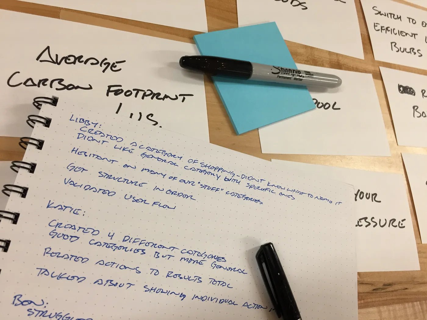
Testers were still confused with the categorization of our actions list. Card sorting would help flush this out. I tested open and closed card sorts to see how users categorized actions. I also put in the main features just to confirm our user journey through the app. This helped us realize that we could narrow it down to 3 categories in our score breakdown. We could drop the ‘stuff’ category and move those actions into the other categories.
Implement:
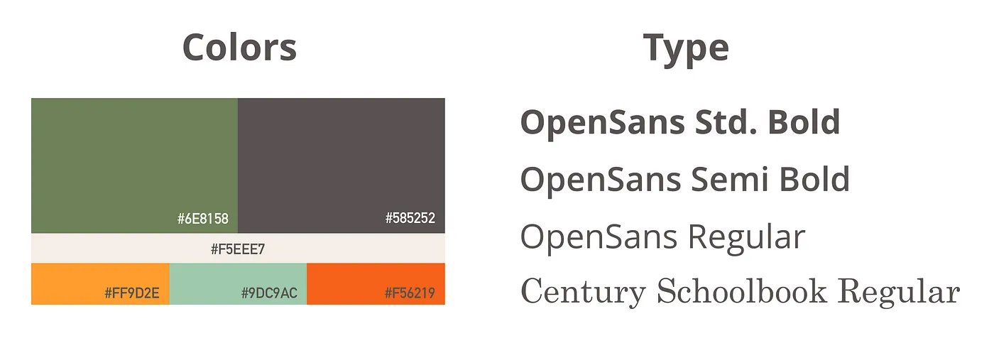
Emma created the illustrations used throughout the app. We worked on copy for the app to keep an encouraging and friendly tone throughout. I started building out the Hi-fi wireframes. We were hesitant but knew that we should use the stereotypical green in our color palette. We decided to pair it with some brighter colors to help take the focus off of the green. We choose Open Sans being a humanistic typeface and paired it with Century Schoolbook to help make it look more official.
Visual Design 1.0:
I put the hi-fi mockups in front of users and described to them the tone we were aiming for. Multiple testers said the colors made it feel heavy and burdensome. The font combination seemed too serious for the friendly tone that we were going for. With this feedback, we looked at our colors and typeface choices.
Visual Design 2.0:
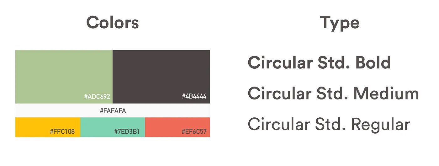
We lightened the green, dropped the cream and brightened the other colors making the palette more playful. We changed the two typefaces out for Circular and used the different weights to achieve visual hierarchy. This typeface is a geometric sans serif that shows balance with a few quirks. This gives the type some warmth and fits with the tone that we are trying to set. I built out the main screens and we tested them again to check to make sure it matched the friendly and encouraging tone we were aiming for.
Final Designs:
We worked together updating the main hi-fi wireframes with our final color and typeface choices. Once we finalized our design layout, I built out the rest of the action pages with the final copy and illustrations. I took the hi-fi mockups and created a final prototype in InVision for the developers. We exported the icons and final designs of the app to hand off as well.
We were able to deliver our final files to the developers on schedule. Once we handed off the final files we were on development support while they finished building the app. During their process, we were able to catch missed interactions and clarify the flow of pages.


Conclusion:
A proverb says “A journey of a thousand miles begins with a single step.” This is true in the context of making an impact on the world’s sustainability. In the end, we can make a difference without drastic and expensive purchases. We helped Becca accomplish her goals and addressed her frustrations by giving her access to:
Find out what her carbon footprint is
See what category she is scoring high in
See a list of actions she can start doing now
Create a checklist with reminders to take those actions
See her weekly, monthly and yearly CO2 impact
With these tools, Becca can learn what she can do and see the impact her choices are having on her carbon footprint now. The question is, does she have enough information to be Conscious of her daily sustainability choices?
Next step:
The final app addressed Becca’s goals and frustrations. Our real test is to get it into the hands of users and the people we gathered research from. These are the people who made up our persona and they would give us real results. We would need to find out, through using the app are these people able to answer what and how to make more sustainable choices daily?
Insights from the process…
The developers were close but not close enough. They were within walking distance. But being able to easily see and ask questions about what we were each working on saves the team time.
Talking about and showing functions and flows are both needed to effectively communicate with the team.
Keeping the meetings lively and making sure you are working together as a team helps reduce the feeling of being overwhelmed and stressed. The result is continual productivity and collaboration.
Working with developers on this project was a great experience of how to collaborate as a team in an agile workflow.